Icons
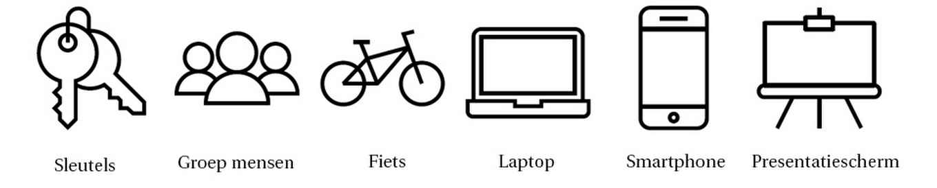
The icons in the corporate identity set are minimalist and consist solely of lines. This allows them to reinforce your message without adding distracting details.
Regular & Bold
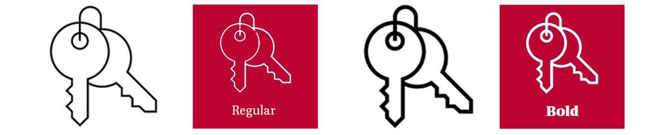
All icons are available in two versions: bold (thick line) and regular (thin line). The same guidelines apply to all icons. To ensure that icons retain their impact, we recommend not displaying them at too small a size.
For digital communications, bold icons should be displayed at a minimum size of 32 × 32 pixels. Regular icons should have a minimum size of 64 × 64 pixels. For print materials, we recommend displaying icons at a minimum size of 10 × 10 mm. When scaling icons, make sure to maintain the correct proportions.
Combining icons with text
Icons should be combined with the corresponding font weight: use a bold icon with bold text and a regular icon with regular text.
Colour
There are four ways to apply colour when using an icon:
- Icon in black on white
- Icon in a corporate identity colour on white
- Icon in black on a corporate identity colour
- Icon in white on a corporate identity colour
Using multiple colours within a single icon, hatching or gradients is not permitted. View all corporate identity colours on the Colour page.
Do’s & Don’ts
- Ensure sufficient contrast between the icon colour and the background colour.
- Scale icons proportionally.
- Do not combine different icons with each other.
- Do not fill icons with a solid colour.
Availability
The icons are available in the image bank as EPS files and as images. To use the EPS files, you will need software such as Adobe Illustrator. A UvANetID login is required to download icons from the image bank. If an icon you need is not available, please request it via huisstijl@uva.nl.
Icon font
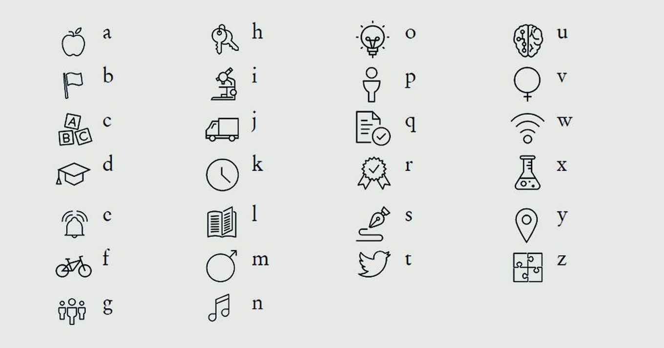
To make the icon set easier to use, an icon font has been developed. You can download the font from the image bank. A UvANetID login is required.
-
Example icon font
The image shows which icon appears for each letter.
Small letters 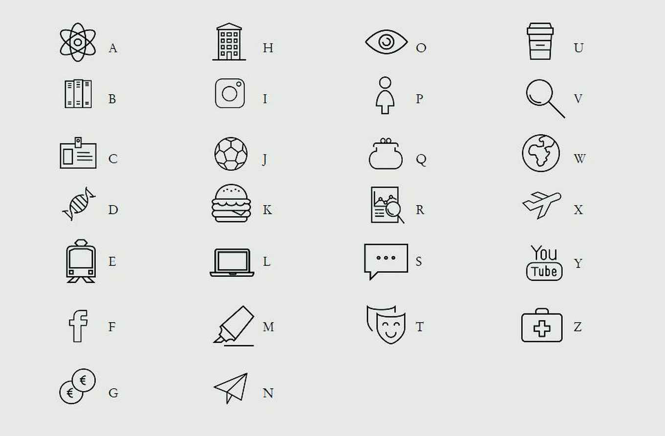
Capital letters